Webflow Guidelines
This style guide contains styles and components that are to be used throughout a website.
Introduction
Arthrex follows the Client-First approach when designing and developing websites in Webflow.
Goals of Client-First
1. To create an organization system for our project
2. To enable speed and flexibility when using Webflow Designer
3. To define a strategy for class usage in the project
4. To standardize a core structure shared across all pages
5. To create a Webflow build that is scalable and easily manageable
6. To help developers, clients, or anyone understand the project
Colors
The different weights of colors used throughout microsites in light-mode and dark-mode.
Gray 900
Gray 800
Gray 700
Gray 600
Gray 400
Gray 300
Gray 200
Gray 100
Dark Mode Blue
Dark Blue
Primary Blue
Light Blue
Highlight Blue
Success
Warning
Danger
There are different background-color- classes.
background-color-dark uses Dark Mode blue.
background-color-100 uses Gray 100.
background-color-200 uses Gray 200.
background-color-900 uses Gray 900.
There are different heading-color- and text-color- classes on light mode and dark mode.
heading-color-white heading-color-light-blue are used only on dark mode.
text-color-100 text-color-200 text-color-300 text-color-white text-color-light-blue are used only on dark mode.
White Heading in Dark-Mode
This is an example of a paragraph on dark background using Gray 100.
This is an example of a paragraph on dark background using Gray 200.
This is an example of a paragraph on dark background using Gray 300.
This is an example of a paragraph on dark background using white.
This is an example of a paragraph on dark background using light blue.
heading-color-800 and heading-color-900 are used only on light mode.
text-color-600 text-color-700 text-color-800 text-color-900 are used only on light mode.
Gray 800 Heading in Light-Mode
Gray 900 Heading in Light-Mode
This is an example of a paragraph on a light background using Gray 600.
This is an example of a paragraph on a light background using Gray 700.
This is an example of a paragraph on a light background using Gray 800.
This is an example of a paragraph on a light background using Gray 900.
Containers
Containers can be used to contain sections of content on a page.
There are three different container- sizes.
container-small has a max-width of 48rem or 768 pixels.
container-medium has a max-width of 64rem or 1,024 pixels.
container-large has a max-width of 80rem or 1,280 pixels.
container-xlarge has a max-width of 90rem or 1,440 pixels.
container-xxlarge has a max-width of 120rem or 1,920 pixels.
You can use a max-width- classes for content nested inside the container.
max-width-xxlarge has a max-width of 80rem or 1,280 pixels.
max-width-xlarge has a max-width of 64rem or 1,024 pixels.
max-width-large has a max-width of 48rem or 768 pixels.
max-width-medium has a max-width of 32rem or 512 pixels.
max-width-small has a max-width of 20rem or 320 pixels.
max-width-xsmall has a max-width of 16rem or 256 pixels.
max-width-xxsmall has a max-width of 12rem or 192 pixels.
Corner Rounding
Corner rounding for containers and nested containers.
There are three different container- sizes.
corner-rounding-default has a radius of .375rem or 6 pixels.
corner-rounding-extra has a radius of 1.5rem or 24 pixels.
Iconography
Icons are a tool for communicating complex ideas to our users and an extension of the Arthrex Brand. Web icons use a 24pt grid.
Icons can be accessed in Webflow under Assets > Core Icons.
Spacing
A spatial system is a set of rules for how you measure, size, and space your UI elements. Uniformity on a spatial level allows your product to be more consistent, your team to communicate better, and reduce the number of decisions designers have to make in a day.
Baseline Grid
Our designs can be divided up into invisible 8px height rows extending the full height of the viewport. Text and other page elements should sit flush against these rows to insure consistent uniform spacing between elements.
Column Grid
A column grid helps you organize content into evenly spaced vertical columns. The space between columns is referred to as the gutter size. Applying your spatial system rules to the gutters will help drive home a consistent rhythm in your designs. The number of columns can vary depending on the width of the viewport but maxes out at 7 columns on desktop. The width of the columns can also vary but 32px gutters are constant.
The class padding-[direction] has different modifiers (size).
padding-xxsmall equals 0.25rem or 4 pixels.
Very small spaces between elements should be avoided in most cases.
padding-xsmall equals 0.5rem or 8 pixels.
The smallest typical unit of spacing. Provides a space between elements but still allows them to be read as a single unit.
padding-small equals 1rem (16 pixels) on desktop and tablet; equals 0.5rem (8 pixels) on mobile.
The minimum amount of space necessary for text elements to be read as separate items. Typically used for padding inside of elements such as cards.
padding-medium equals 2rem (32px) on desktop and tablet; equals 1.5rem (24px) on mobile.
Column grid gutter width and the default spacing between common page elements such as a collection of cards.
padding-large equals 3rem or (48px) on desktop and tablet; equals 1.5rem (24px) on mobile.
Used when differentiating between distinct sections of content.
padding-xlarge equals 4rem (64px) on desktop and tablet; equals 2rem (32px) on mobile.
Used when differentiating between distinct sections of content.
padding-xxlarge equals 5rem (80px) on desktop; equals 4rem (64px) on tablet; equals 2rem (32px) on mobile.
Used when differentiating between distinct sections of content (most common).
padding-huge equals 6rem (96px) on desktop; equals 5rem (80px) on tablet; equals 3rem (48px) on mobile.
Huge spaces used when differentiating between distinct sections of content.
padding-xhuge equals 7rem (112px) on desktop; equals 6rem (96px) on tablet; equals 4rem (64px) on mobile.
Very huge spaces used when differentiating between distinct sections of content. Should be avoided in most cases.
padding-xxhuge equals 8rem (128px) on desktop; equals 7rem (112px) on tablet; equals 5rem (80px) on mobile.
Extremely huge spaces used when differentiating between distinct sections of content. Should be avoided in most cases.
padding-xsmall equals 0.5rem or 8 pixels.
The smallest typical unit of spacing. Provides a space between elements but still allows them to be read as a single unit.
Shadows
Arthrex uses three distinct drop-shadows: small, regular and large.
When to Use
Shadows are most commonly used on hover to indicate an interaction or to increase the prominence of an interactive element. For example, if someone hovers over a card and a drop-shadow appears, it indicates that this is a clickable element.
shadow-small
shadow-regular
shadow-large
Typography
Typography can help create clear hierarchies, organize information, and guide users through a product or experience.
Typeface
Arthrex uses the typeface Proxima Nova. It fits our needs as a leading global medical technology company and reflects Arthrex’s values of practicality and beautiful simplicity . Proxima Nova can be and downloaded from Share Point
Type Color
For headings heading-color-900 should be used, with pure Black as an option when greater emphasis is needed.
For normal body text text-color-700 should be used to help emphasize headings and reduce eye strain. If using a background-color-200 this can be shifted to text-color-800 text for increased contrast.
On white or light gray backgrounds, text-style-link should be used for links. On dark backgrounds, link-color-light-blue should be used as a combo class. In the footer, link-style-footer should be used as a combo class.
In dark themes or on dark backgrounds Neutral Colors are inverted with pure Black becoming pure White. text-color-900 becomes text-color-100 or text-color-white
text-color-800 becomes text-color-200
text-color-700 becomes text-color-300
Type Spacing
Each line of text should be aligned with our baseline grid, see spacers for more details.
heading-style-h1
This is an H1 heading
heading-style-h1 combined with heading-size-large
This is a large H1 heading
heading-style-h1 combined with heading-weight-bold
This is a bold H1 heading
heading-style-h2
This is an H2 heading
heading-style-h2 combined with heading-size-large
This is a large H2 heading
heading-style-h2 combined with heading-weight-bold
This is a bold H2 heading
heading-style-h3
This is an H3 heading
heading-style-h4
This is an H4 heading
heading-style-h5
This is an H5 heading
heading-style-h6
This is an H6 heading
heading-style-sub
text-style-paragraph
This is some paragraph text.
text-size-small
text-size-large
This is some larger paragraph text.
text-style-italic
This is some italic paragraph text.
text-style-allcaps
This is some text in all caps.
text-style-link
This is some text styled for a link.
text-style-link combined with link-color-light-blue
This is some text styled for a link on a dark background.
text-style-link combined with link-style-footer
text-weight-semibold combined with text-color-900
This is some paragraph text with emphasis.
text-weight-semibold combined with text-size-large and text-color-900
This is some larger paragraph text with emphasis.
text-align-center
This is some centered paragraph text.
text-align-right
This is some right-aligned paragraph text.
text-align-left
This is some left-aligned paragraph text.
This is some smaller paragraph text.
Accordion
In web design, an accordion displays a list of headings that, when clicked, expand to display additional information for that heading.
When to Use
Accordions should be used in instances where detailed information is helpful, but not required for users to understand the full story. By only showing the headings, the content is easier for users to navigate and find what they're looking for.
Accordions are commonly used on marketing pages to display FAQs or high-level value propositions.


This is an H3 heading
This is an H3 heading
This is an H3 heading
This is an H3 heading
This is an H3 heading
This is an H3 heading
This is an H3 heading
This is an H3 heading
This is an H3 heading
This is an H3 heading
This is an H3 heading
This is an H3 heading
This is an H3 heading
This is an H3 heading
This is an H3 heading
This is an H3 heading
This is a question
This is a question
This is a question
This is a question
This is a question
This is a question
This is a question
This is a question
This is a question
This is a question
This is a question
This is a question
This is a question
This is a question
This is a question
This is a question
Buttons
Buttons are used to initialize an action. Button labels express what action will occur when the user interacts with it.
Overview
Buttons are clickable elements that are used to trigger actions. They communicate calls to action to the user and allow users to interact with pages in a variety of ways. Button labels express what action will occur when the user interacts with it.
Anatomy
A button can consist of either a text label, icon, or both.
Usage
Use an outlined button after a filled one; do not use multiple filled buttons together
Do not use more than 3 buttons
Buttons should match text allignment
Cards
A card can support many types of content, but at a minmum must support a label and one other piece of information. It may consist of an image, label, title, links, descriptive text, category.

This is an H3 heading
This is placeholder text meant to describe the value prop in more detail. This text should be no less than 50 and no greater than 150 characters.
This is an H3 heading
This is placeholder text meant to describe the value prop in more detail. This text should be no less than 50 and no greater than 150 characters.
This is an H3 heading
This is placeholder text meant to describe the value prop in more detail. This text should be no less than 50 and no greater than 150 characters.
This is an H3 heading
This is placeholder text meant to describe the value prop in more detail. This text should be no less than 50 and no greater than 150 characters.
Copyright
Each page should have only one copyright placed in the Footer. Automatic year updates will not work if there is more than one copyright placed on the page.
For automatic year updates, add the following script to the <head> of your site.
<script>document.addEventListener("DOMContentLoaded", function() {
const yearSpan = document.querySelector('.copyright-year');
const currentYear = new Date().getFullYear();
yearSpan.textContent = currentYear;
});</script>

© 2021 Arthrex, Inc. All rights reserved
© 2021 Arthrex, Inc. All rights reserved

Error 404 Message
The Error 404 Message should be used on the 404 page when content is unavailable.
Our apologies
The page you requested cannot be found.

Our apologies
The page you requested cannot be found.
Footer
On websites in which the primary objective is to direct users to find a doctor, the Find a Doctor (Footer) component should be used prior to the Footer component.
In the footer, each page on the website should be linked. Additionally, external websites and social platforms may be linked. The Copyright component should also be included and the copyright script should be added under Site Settings > Custom Code.
NEW: Surgeon App Banner for surgeon microsites as well as landing Pages. Light and Dark Color can be switched within the component variant and can be hidden in the footer component. There are 3 GSAP Animations connected to the component: 1. animate text, 2. add position fixed on page load, 3. hide banner on scroll (will no longer be fixed and appear in it's appropriate spot on the website afterwards). Please feel free to change these according to microsite needs and purposes.
Following GA attributes are added as well and need to be set up per project by appropriate SEO Specialist: data-ga-category = Surgeonapp Button / data-ga-action = Open App Store // Open Google Play Store / data-ga-label = Banner
Find a Doctor Near You
© 2021 Arthrex, Inc. All rights reserved


Find a Doctor Near You
© 2021 Arthrex, Inc. All rights reserved
Forms
Forms may be used to collect information from users (as permitted by Legal/Compliance) or to funnel them to another page. In Webflow, some examples of form use cases might include:
1. Find a Doctor
2. Contact Form
3. Cookie Settings
4. Patient Quiz
Image and Value Props
The Image and Value Props component is used to describe high level value points to a user.
When to Use
The Image and Value Props component is most frequently used on a marketing landing page.
This is an H3 heading
This is placeholder text meant to describe the value prop in more detail. This text should be no less than 50 and no greater than 150 characters.
This is an H3 heading
This is placeholder text meant to describe the value prop in more detail. This text should be no less than 50 and no greater than 150 characters.
This is an H3 heading
This is placeholder text meant to describe the value prop in more detail. This text should be no less than 50 and no greater than 150 characters.
This is an H3 heading
This is placeholder text meant to describe the value prop in more detail. This text should be no less than 50 and no greater than 150 characters.
This is an H3 heading
This is placeholder text meant to describe the value prop in more detail. This text should be no less than 50 and no greater than 150 characters.
This is an H3 heading
This is placeholder text meant to describe the value prop in more detail. This text should be no less than 50 and no greater than 150 characters.
Navigation
The navigation component sticks to the top of the page and helps the user navigate the site. This may include links to internal and external pages, anchor links, dropdown and flyout menus, and a primary CTA.

Tables
The most common type of table used on Webflow sites is the Cookies Table.
When to Use
The Cookies Table may be used inside a cookies-dropdown-list to list the types of cookies used on a Webflow site.
Tabs
Tabs are used for high-level navigation between exclusive content groups.
Sliders
Sliders help display content dynamically and progressively. Sliders are ideal for displaying content that is frequently subject to change - such as banners, news articles, blogs, etc.
Types of Sliders
There are two styles of sliders - slide-style-card and slide-style-banner.
Slide Elements
A slide may consist of several elements, including an image, tag(s), title, descriptive text, and/or a link.
CMS Collections
While sliders can include static content, most sliders will pull content in dynamically via Webflow CMS Collection Lists. Collection lists can be filtered, sorted, and limited using the collection list settings.
Limit to Number of Slides
The UX team recommends using between 3-4 slides in a slider and no more than 5.
A Note to Developers
In Webflow, we use Splide to create slider components.
Each splide contains a splide__track and a secondary splide. The splide__track contains the splide__list and an Empty State option. The secondary splide contains arrows and pagination for that slider.
The splide__list contains the collection items from a collection list. Each collection item has a class of splide__slide.
There are two slide styles: slide-style-card and slide-style-banner. The style classes are applied as a combo class to splide__slide. For banners, the style class is also be applied as a combo class to splide.
To add a slider to a page:
Select and copy the desired splide from the components below.
Go to the page and section where you want to place your slider and paste.
Sliders work best in full-screen width, so it's best to paste them directly inside the section_ instead of inside padding-global or a container-.The slider functionality will not work yet. On each page that a splide component is used, you must copy/paste the splide script to both the <head> and before the </body> in the page settings. The script can be accessed under the Custom Code settings for this page.
Connect your splide__list to a CMS collection. For how to do this, see Webflow's documentation.
For sliders with the slide-style-banner class, ensure the images in the collection connected to banner_image are using a 2:1 aspect ratio (minimum 1300px by 650px) and have a transparent background.
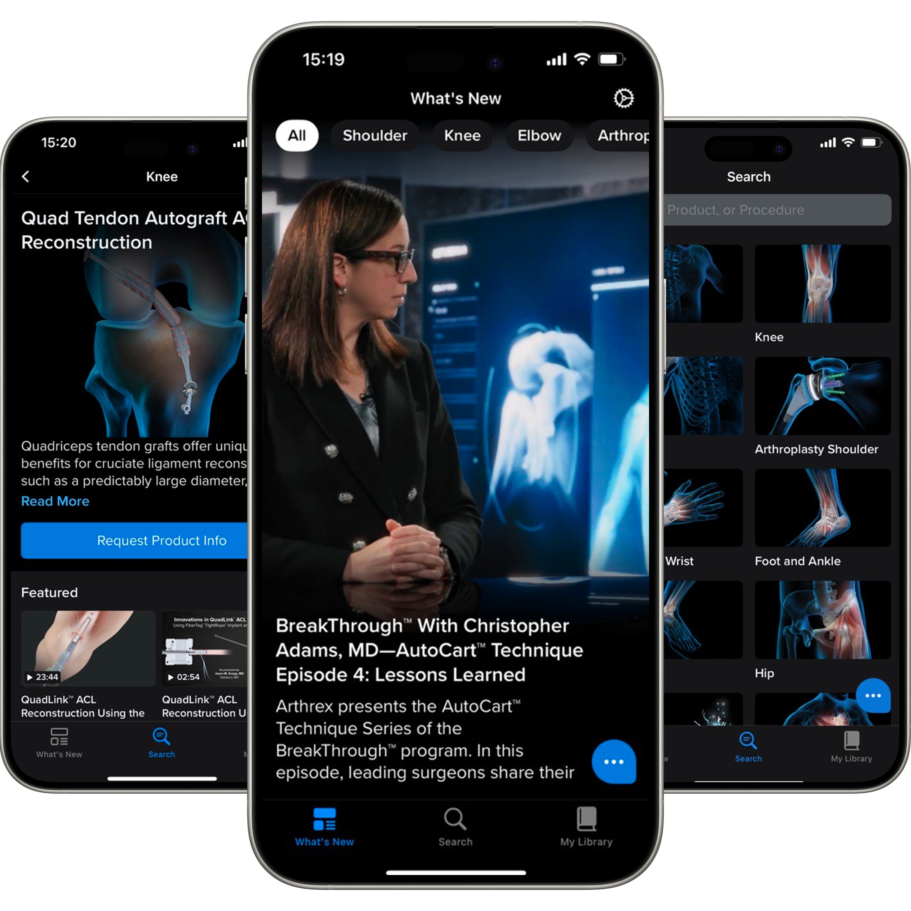
Advertising for the Arthrex Surgeon App
For Websites, Landingpages, Microsites
Two variants
There are two variants, one in dark and one in light
The Arthrex Surgeon App
Stay Up-to-Date on Arthrex Innovations
The Arthrex Surgeon App provides 24/7 mobile access to our extensive digital orthopedic knowledge and resource library. The app allows you to consume content online as well as offline.
Features a variety of resources, including articles, videos, presentations, and more
Supports surgeons in their continuing education and provides access to relevant information
Optimized for tablet and mobile
Videos
Videos should be tagged with a video class.
When to Use
When possible, use Webflow's Youtube element instead of the Video element. The analytics team can tag a video when using the Youtube element, but not the Video element.
If a YouTube version of the video is unavailable or unaccepted, a Cloudinary version of the video may be embedded.
Video Transcripts
Video transcripts are tagged with a dropdown-transcript class.
When to Use
Video transcripts can be used directly below or to the side of a video used on a Webflow site. The dropdown-transcript_text should include the transcript text.
Social Links
There are two options for social links: regular and small.
When to Use
Social links are primarily used in the footer component of a website.